Tufts Health Plan Internal Campaign: ALL IN
A campaign to generate excitement and awareness for a new software.
Project Summary
In response to the launch of a new in-house software platform, a transformative internal campaign was conceived to generate enthusiasm and promote active engagement among Tufts Health Plan employees. The culmination of this creative initiative resulted in the birth of “ALL IN” – a meticulously crafted logo identity and campaign name designed to embody universal inspiration and motivation.
The name “ALL IN” was deliberately chosen for its profound connotations, encapsulating a go-getter mentality and fostering a spirit of unity and collaboration within the team. It reflects a collective commitment to excellence and the pursuit of greatness through collective effort. This inclusive approach signifies not just individual dedication but a shared journey towards achieving remarkable feats together.
The logo identity is a visual manifestation of the campaign’s ethos, leveraging the brand logo as a foundation. The incorporation of human figures in the icon serves as a powerful metaphor for unity, emphasizing the collective strength derived from a diverse team working seamlessly together. The dynamic, forward-thinking movement portrayed in the icon symbolizes the continuous progress and innovation inherent in the collaborative efforts of the entire team.
The “ALL IN” campaign is poised to instill a sense of purpose and excitement among Tufts Health Plan employees, encouraging them to embrace the new software platform with enthusiasm and dedication. Through this distinctive internal campaign, Tufts Health Plan reinforces its commitment to a culture of teamwork, innovation, and collective achievement, fostering a work environment where everyone is truly “ALL IN” for the shared success of the organization.
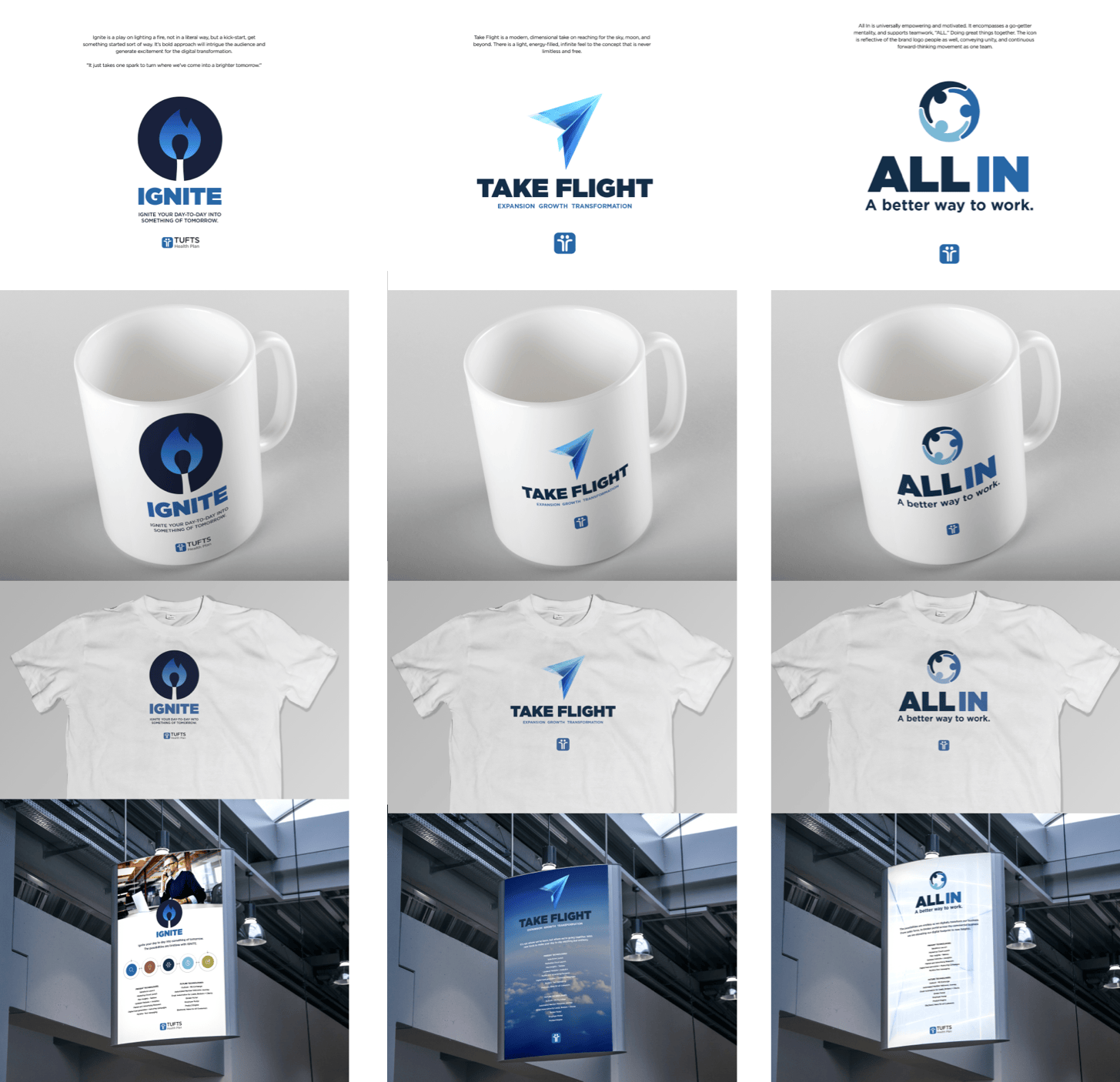
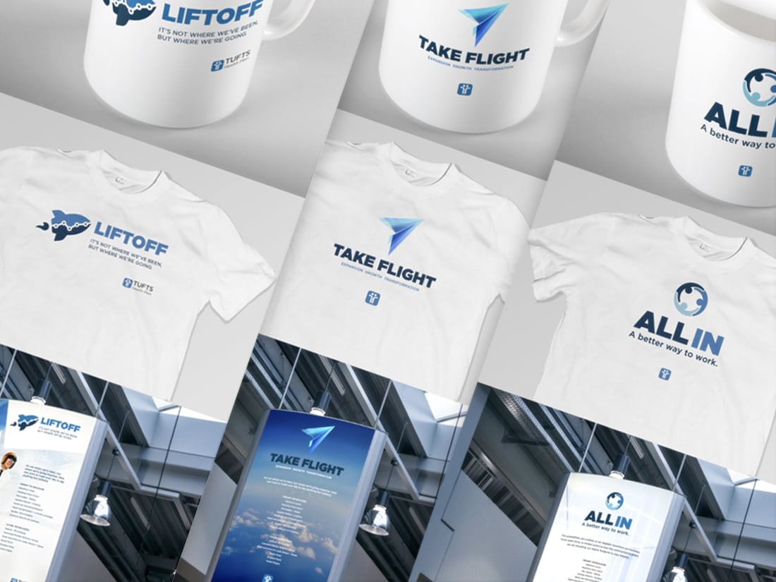
ALL IN Evolution
Five concepts for a name and visual representation were presented before the final one was selected. ALL IN is featured last here(far right), and two out of the five other concepts are shown here prior. The names of all five campaign concepts were; ALL IN, IGNITE, TAKE FLIGHT, LIFT OFF, and SURGE–all screaming excitement, energy, and innovation!