
Color isn’t just decoration—it’s one of your brand’s most powerful communication tools. Within milliseconds of seeing your logo, website, or product packaging, potential customers form impressions that can make or break their relationship with your brand. For B2B leaders evaluating digital projects or considering brand updates, understanding how color psychology influences brand perception isn’t just useful—it’s essential for building trust, conveying professionalism, and differentiating in competitive markets.
Whether you’re launching a new product line, redesigning your website, or developing a comprehensive digital experience, the colors you choose send immediate signals about your company’s values, quality level, and target audience. But here’s the thing: there’s no universal “best color” for business success. The most effective color strategies balance psychological impact with practical considerations like versatility, cost, and cultural context.
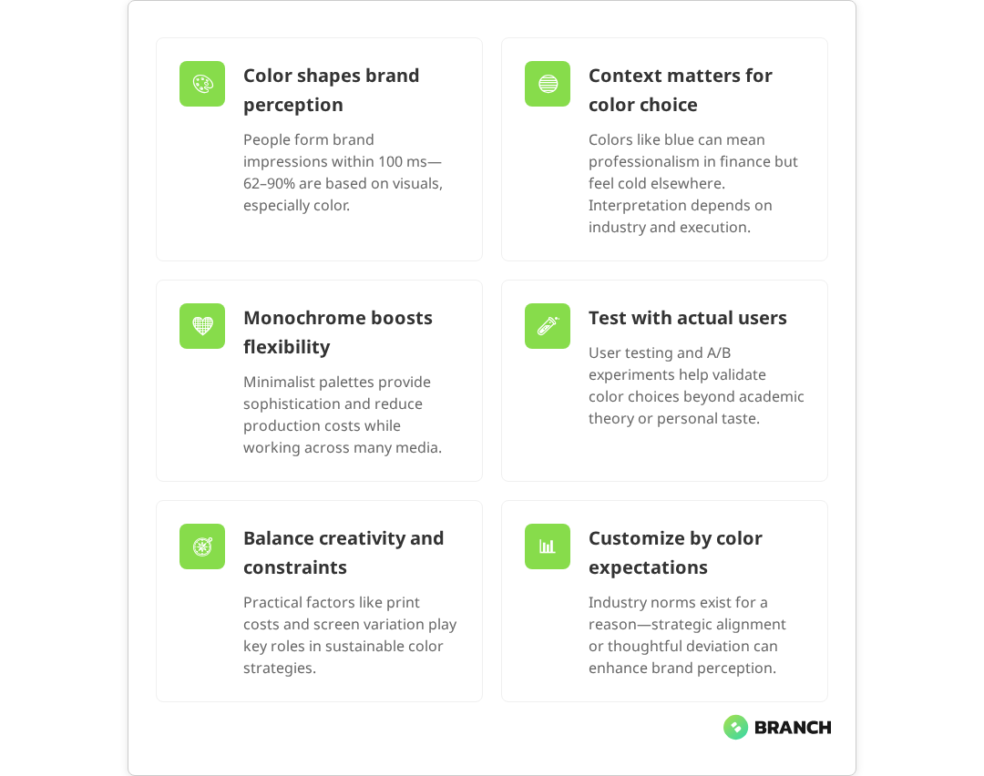
Let’s dig into how color psychology actually works in practice, when it matters most, and how to make evidence-based decisions that strengthen rather than confuse your brand message.
The Psychology Behind Color Perception
Color perception happens in two stages: the immediate emotional response and the contextual interpretation. When someone sees your brand colors, their brain processes the visual information faster than conscious thought, triggering associations based on cultural learning, personal experience, and evolutionary patterns. Research shows that these rapid responses can occur within 50 to 100 milliseconds, often before we’re consciously aware of what we’re seeing.
Red, for instance, can signal urgency and energy—perfect for a fitness brand but potentially problematic for a financial services firm where trust and stability matter more. Blue often conveys reliability and professionalism, which explains why it’s popular in tech and finance. But these aren’t hard rules. Context, industry expectations, and execution all play crucial roles in how colors are interpreted.
What’s particularly interesting is how color works alongside other visual elements. A muted blue paired with clean typography and plenty of white space reads very differently from the same blue used with bold fonts and busy layouts. The psychological impact comes from the complete visual system, not just the color itself.
For B2B organizations, this means your color strategy needs to align with both your audience’s expectations and your actual business goals. A biotech startup might benefit from colors that suggest innovation and precision, while a consulting firm might prioritize colors that communicate experience and trustworthiness.
The Rise of Monochrome and Minimalist Branding
One of the most significant trends in modern branding is the shift toward monochrome or near-monochrome color palettes. Major brands across industries—from automotive to electronics to professional services—are embracing black, white, and single-color approaches for both strategic and practical reasons.
The strategic appeal is clear: monochrome branding often conveys sophistication, timelessness, and premium positioning. It also offers remarkable versatility. A logo that works in black and white will function across any medium, from digital screens to embroidered uniforms to large-scale building signage. This flexibility becomes increasingly valuable as brands need to work across more touchpoints than ever before.
Read more about developing cohesive visual identities that work across all touchpoints.But there’s a practical side too. Monochrome designs reduce production costs, simplify brand guidelines, and eliminate the risk of color reproduction issues across different vendors and materials. For growing B2B companies that need their brand to work consistently across everything from business cards to trade show displays, this simplicity can be a significant advantage.
However, minimalist doesn’t mean colorless everywhere. Many successful brands use a neutral primary identity but introduce color strategically—perhaps different colors for different product lines, or vibrant accents in digital interfaces while maintaining a neutral logo and core identity.
Strategic Color Applications Across Touchpoints
The most sophisticated brand color strategies recognize that different contexts call for different approaches. Your primary brand colors might work perfectly for your website header, but need adaptation for social media, product interfaces, or physical environments.
Consider how color strategy varies across these key touchpoints:
| Touchpoint | Color Considerations | Flexibility Level |
|---|---|---|
| Logo & Core Identity | Maximum recognition, versatility across media | Low – should remain consistent |
| Website & Digital Interfaces | Usability, accessibility, screen optimization | Medium – can adapt for UX needs |
| Social Media | Platform norms, attention-grabbing, seasonal relevance | High – can vary for engagement |
| Product Packaging | Shelf appeal, material constraints, printing costs | Medium – function drives decisions |
| Physical Environments | Lighting conditions, architectural integration, longevity | Low – expensive to change |
Smart brands develop color systems that provide both consistency and flexibility. They might use a neutral primary palette for core brand elements while allowing product teams to use accent colors that serve specific functional or emotional purposes.
Read more about developing comprehensive brand strategies that align visual and strategic goals.This systematic approach becomes especially important for B2B companies with multiple products or services. A software company might use consistent blues and grays for enterprise products while allowing brighter colors for tools aimed at startups or creative teams. The key is maintaining brand recognition while adapting to different audience needs and contexts.
Industry Context and Audience Expectations
Color psychology doesn’t exist in a vacuum—it operates within industry conventions and audience expectations. What works for a children’s toy brand would be completely inappropriate for a medical device company, not because the colors themselves are “wrong,” but because they conflict with established industry norms and user expectations.
In B2B contexts, certain color conventions have emerged for good reasons. Financial services often gravitate toward blues and greens because they suggest stability and growth. Healthcare organizations frequently use blues and whites to convey cleanliness and trustworthiness. Technology companies often prefer blues, grays, and whites to suggest innovation without seeming frivolous.
These conventions aren’t arbitrary—they reflect what audiences have learned to expect from professional services in these industries. Violating these expectations can work, but research shows it requires careful strategy and usually involves trade-offs. Brands that break color conventions may stand out, but they risk confusing consumers unless the deviation is well-justified and aligned with the brand’s identity.
That said, subtle differentiation within industry norms can be highly effective. If all your competitors use similar shades of blue, a carefully chosen purple or teal might help you stand out while still feeling appropriate for your industry. The key is understanding why the conventions exist before deciding whether to follow or thoughtfully break them.
What the research says
- Studies confirm that consumers form brand impressions within 50-100 milliseconds of visual exposure, with 62-90% of these judgments based on visual elements, particularly color.
- Color preferences and emotional responses vary significantly by demographics, culture, and personal experience—younger consumers tend to prefer vibrant hues while older consumers favor traditional tones.
- Monochrome and simplified color palettes demonstrably reduce production costs while improving brand consistency across different materials and vendors.
- Digital accessibility guidelines require minimum contrast ratios of 4.5:1 for normal text and 3:1 for large text to ensure readability for users with visual impairments.
- Early research suggests that A/B testing and user feedback can reveal significant differences in how color choices perform with target audiences, though more studies are needed on optimal testing methodologies.
- Industry color conventions are well-established but research is mixed on whether following or strategically breaking these norms is more effective for brand differentiation.
Balancing Psychology with Practicality
While color psychology provides valuable insights, practical considerations often drive the most successful brand color decisions. These include everything from production costs to accessibility requirements to the technical constraints of different media.
For digital-first B2B companies, screen optimization becomes crucial. Colors that look vibrant on a designer’s monitor might appear dull on typical office displays or mobile devices. Colors that work beautifully on retina displays might create accessibility issues for users with visual impairments. Smart color strategies account for these technical realities from the start.
Production considerations matter too. A color that requires special inks for printing will increase costs for every piece of marketing collateral. A logo that only works in full color will be problematic for single-color applications like faxes, stamps, or embroidery. These practical constraints often make the difference between a color system that enables growth and one that creates ongoing headaches.
- Digital accessibility: Ensure sufficient contrast ratios for all text and interface elements
- Print production: Consider ink costs and color matching across different vendors
- Screen variations: Test colors across different devices and display types
- Material applications: Verify colors work on fabric, metal, plastic, and other surfaces you’ll use
- International considerations: Research color meanings in markets where you operate
The most successful B2B brands treat these practical considerations as creative constraints that lead to stronger, more versatile color systems rather than obstacles to overcome.
Testing and Validation
Color decisions based purely on theory or personal preference often miss the mark. The most effective approach combines psychological insights with real-world testing and validation. This is especially important for B2B brands where purchase decisions involve multiple stakeholders with different perspectives and priorities.
User testing doesn’t have to be elaborate. Even simple A/B tests comparing different color approaches for key interface elements can provide valuable insights. Focus groups with actual customers can reveal associations and reactions that might not be obvious to internal teams. The goal isn’t to design by committee, but to understand how your color choices land with the people who matter most—your actual and potential customers.
Read more about comprehensive branding and design approaches that integrate user research and testing.For digital applications, analytics can provide ongoing feedback. Heat mapping can show whether certain colored elements attract or repel attention. Conversion testing can reveal whether color changes improve or hurt performance. This data should inform iterative improvements to your color strategy over time.
Working with Design and Development Partners
Implementing an effective color strategy often requires expertise that spans psychology, design, technology, and business strategy. For B2B organizations serious about getting this right, working with experienced design and development partners can accelerate both the strategic development and technical implementation.
The right partner will help you balance aspirational brand goals with practical constraints, test color approaches with real users, and build systems that maintain color consistency across all touchpoints. They’ll also future-proof your color strategy by considering how it will work as your organization grows and evolves.
Look for partners who ask about your business objectives, audience needs, and technical constraints—not just your color preferences. The best collaborators will challenge assumptions while respecting your industry knowledge and organizational culture.
Implementation and Evolution
A great color strategy is only as good as its implementation. This means developing clear guidelines that enable consistent application across all touchpoints while providing enough flexibility for different contexts and evolving needs.
Brand guidelines should specify not just which colors to use, but how to use them—including hierarchy, proportion, and interaction with other design elements. They should also address common scenarios like social media posts, presentation templates, and trade show materials.
But guidelines alone aren’t enough. Successful implementation requires training team members who will apply the colors, establishing approval processes for new applications, and creating systems that make correct usage easier than incorrect usage.
Remember that brand color strategies should evolve thoughtfully over time. What works for a startup might need adjustment as the company matures. What works in one market might require adaptation for international expansion. The key is making changes deliberately and strategically rather than reactively or randomly.
FAQ
Should B2B companies choose different colors than B2C companies?
Not necessarily. While B2B brands often favor more conservative color palettes, the most important factor is alignment with your specific audience and industry context. A B2B creative agency might use bold colors effectively, while a B2C financial services company might prefer conservative tones. Focus on what works for your actual customers rather than broad B2B vs B2C generalizations.
How do I know if my current brand colors are working effectively?
Look at both quantitative and qualitative indicators. Track metrics like website conversion rates, brand recognition surveys, and sales cycle length. Also gather qualitative feedback from customers, prospects, and internal teams about brand perception. If your colors consistently create confusion about your positioning or fail to differentiate you from competitors, it might be time for an update.
Is it better to follow industry color conventions or differentiate with unique colors?
The best approach usually involves strategic differentiation within acceptable industry norms. Completely ignoring conventions can confuse or alienate your audience, but copying competitors exactly won't help you stand out. Look for opportunities to use familiar colors in fresh ways or choose variants that feel appropriate for your industry while still being distinctly yours.
How much should practical considerations like printing costs influence color choices?
Practical constraints should be considered early in the process, not as afterthoughts. A color strategy that looks beautiful but creates ongoing cost or implementation problems will ultimately hurt your brand more than help it. The most successful approaches find creative solutions that satisfy both aesthetic and practical requirements. Sometimes constraints actually lead to stronger, more memorable solutions.
When should we consider updating our brand colors versus keeping them consistent?
Consider updates when your current colors no longer serve your strategic goals—such as expansion into new markets, significant changes in positioning, or evolution in your target audience. However, avoid changes purely for the sake of novelty. Brand colors are long-term investments in recognition and trust. When changes are needed, make them deliberately and ensure they're supported by solid strategic reasoning and user research.