
Your brand’s typography is working harder than you think. Research in typography psychology consistently shows that every time someone encounters your website, app, or marketing materials, your font choices are quietly communicating your company’s personality, values, and professionalism—often before they’ve read a single word.
For B2B organizations, especially those building digital products or eLearning platforms, typography isn’t just about looking good. It’s about creating consistent, accessible experiences that work across stakeholders, from technical teams to C-suite executives who need to quickly grasp complex information.
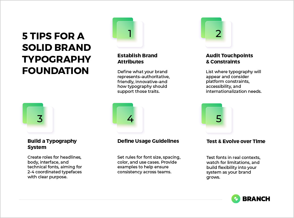
The challenge? Most teams approach typography as an afterthought, leading to inconsistent experiences and missed opportunities to strengthen their brand presence. Here’s how to get it right from the start.
Why Typography Matters More Than Ever
In digital environments, typography carries an enormous burden. It needs to be legible on everything from massive conference room displays to mobile phones, while maintaining your brand’s voice across platforms. For B2B companies, this challenge is amplified—your typography needs to work equally well in a technical documentation site, a sales presentation, and an executive dashboard.
The stakes are higher than aesthetic preference. Poor typography choices can undermine trust, reduce comprehension, and create friction in user experiences. Multiple studies demonstrate that typography impacts first impressions, credibility, and emotional response, with poorly chosen fonts leading to confusion and negative brand perceptions. When your sales team is walking a prospect through a demo, or when a learning platform needs to convey complex concepts clearly, typography becomes a critical business tool.
The Architecture of Brand Typography
Effective brand typography isn’t about choosing one perfect font. It’s about creating a typographic system that includes multiple variations for different use cases. Think of it as building a toolkit where each piece serves a specific purpose.
The Core Components You Need
A robust typography system typically includes at least three distinct roles:
-
- Headlines and display text: Your primary brand voice, often more distinctive and personality-driven
-
- Body text: Optimized for readability and extended reading, especially important for content-heavy platforms
-
- Interface and functional text: Clear, utilitarian fonts for buttons, forms, navigation, and data displays
Some organizations benefit from additional specialized fonts for specific contexts—perhaps a technical monospace font for code examples, or a condensed variant for data tables where space is at a premium.
| Typography Role | Primary Purpose | Key Characteristics | Common Applications |
|---|---|---|---|
| Display/Headlines | Brand expression and hierarchy | Distinctive, attention-grabbing | Page titles, marketing headlines, logos |
| Body Text | Extended reading comfort | Highly legible, neutral | Articles, documentation, descriptions |
| Interface | Functional clarity | Clear at small sizes, wide character support | Buttons, forms, navigation, dashboards |
| Data/Technical | Information density | Monospace or condensed, high clarity | Tables, code, technical specifications |
Read more about creating comprehensive design systems that scale.
What the research says
-
- Typography systems organized into distinct roles (headlines, body text, interface elements) are more effective than single-font approaches, with professional design systems consistently using 2-4 coordinated typefaces
-
- Body text optimized for extended reading should use neutral typefaces with appropriate sizing (16-18px for web) and adequate spacing to support comprehension in articles and documentation
-
- Interface fonts must prioritize functional clarity and remain legible at small sizes, with sans-serif typefaces preferred for UI elements like buttons and navigation
-
- Early research suggests that consistent typography application across brand touchpoints strengthens recognition and trust, though more comprehensive studies on cross-platform typography effectiveness are still needed
The Selection Process: Beyond Personal Preference
Choosing typography for your brand requires balancing multiple factors that go well beyond “what looks nice.” The most successful typographic choices emerge from understanding your specific context and constraints.
Start with Your Brand’s Core Attributes
Before you open a font library, spend time articulating what your brand represents. Is your company innovative and forward-thinking, or established and trustworthy? Are you approachable and friendly, or authoritative and professional? Your typography should reinforce these attributes, not compete with them.
For B2B organizations, this often means balancing professionalism with approachability. A law firm might lean heavily toward traditional, authoritative fonts, while a tech startup might embrace more contemporary choices. But most B2B brands live somewhere in the middle—they need to appear both competent and human.
Consider Your Technical Requirements
Typography decisions have practical implications that extend far beyond aesthetics:
-
- Platform constraints: Web fonts, mobile apps, and print materials all have different technical requirements and performance considerations
-
- Accessibility: Some fonts are inherently more accessible than others, particularly for users with dyslexia or visual impairments
-
- Loading performance: Web fonts impact site speed, which affects both user experience and SEO
Read more about developing comprehensive visual identities that work across touchpoints.
Implementation: From Selection to System
Once you’ve chosen your fonts, the real work begins. Creating a functional typography system requires defining specific usage guidelines that prevent inconsistency and confusion down the line.
Define Clear Usage Rules
Successful typography systems include explicit guidance about when and how to use each font variation. This isn’t just helpful for design teams—it’s essential for anyone in your organization who creates customer-facing materials.
Your guidelines should specify:
-
- Exact font weights and sizes for different contexts (headlines, subheads, body text, captions)
-
- Line spacing and paragraph spacing standards
-
- Color applications and contrast requirements
-
- Spacing around text elements and minimum size requirements
-
- Clear examples of correct and incorrect usage
Visual examples are particularly valuable here. Showing what your typography looks like when used correctly—and incorrectly—helps prevent misinterpretation and streamlines onboarding for team members and external partners.
Test Across Real Contexts
Before finalizing your typography choices, test them in the environments where they’ll actually be used. How does your chosen body font perform in a dense data table? Does your headline font maintain its personality when used in a mobile app navigation? Can your interface font handle technical terminology without becoming cramped?
This testing phase often reveals practical limitations that weren’t apparent during initial selection. It’s much better to discover these issues before you’ve committed to a full brand rollout.
Making Typography Decisions: Custom vs. Off-the-Shelf
One of the biggest decisions you’ll face is whether to use existing fonts or invest in custom typography. Like most branding decisions, the right answer depends on your specific situation and resources.
When Standard Fonts Work Well
High-quality commercial and open-source fonts can serve most organizations beautifully. This approach makes sense when:
-
- Your brand strategy emphasizes reliability and approachability over distinctiveness
-
- You need to implement quickly and cost-effectively
-
- Your typography will primarily appear in standard digital contexts
-
- You have limited resources for ongoing font maintenance and licensing management
When to Consider Custom Typography
Custom fonts represent a significant investment, but they can be worthwhile for organizations that need truly distinctive brand expression or have specific technical requirements that existing fonts can’t meet. Consider custom typography when:
-
- Your brand strategy depends on strong visual differentiation in your market
-
- You have specific technical needs (unusual character sets, specialized applications)
-
- You’re building digital products where typography is a key part of the user experience
-
- You have the budget and timeline to support custom development and ongoing maintenance
Working with Design Partners
Typography selection often benefits from external perspective, particularly for organizations that don’t have extensive in-house design expertise. The right design partner can help you navigate the balance between brand expression and practical requirements.
When evaluating potential partners, look for teams that ask about your specific use cases and technical constraints, not just your aesthetic preferences. The best collaborators will want to understand where your typography will live—from software interfaces to printed materials—and how it needs to perform in each context.
A good design partner will also help you think through implementation and scalability. They should be able to create not just font recommendations, but comprehensive guidelines that your team can follow confidently across different applications and contexts.
Avoiding Common Typography Pitfalls
Even well-intentioned typography projects can go astray. Here are the most common mistakes we see, and how to avoid them:
-
- Choosing fonts in isolation: Selecting typography without considering how it will work alongside your other brand elements often leads to visual conflicts
-
- Ignoring technical constraints: Beautiful fonts that don’t load properly on mobile or lack necessary character sets create more problems than they solve
-
- Over-complicating the system: Using too many different fonts creates visual chaos and implementation headaches
-
- Under-documenting usage guidelines: Without clear rules, even good typography choices get applied inconsistently
-
- Forgetting about accessibility: Typography choices that ignore readability and accessibility requirements can exclude significant portions of your audience
The Long Game: Typography That Grows With Your Brand
The best typography systems are designed to evolve. As your organization grows and changes, your typography should be flexible enough to accommodate new applications and contexts without requiring complete overhauls.
This means building in room for expansion—perhaps leaving space for additional font weights or considering how your chosen fonts might work in contexts you haven’t yet imagined. It also means documenting not just what you’ve chosen, but why you’ve chosen it, so future decisions can build on the same strategic foundation.
Typography is an investment that compounds over time. When done thoughtfully, it becomes an invisible foundation that makes everything else in your brand system work more effectively. When done poorly, it creates friction and inconsistency that undermines your brand at every touchpoint.
The goal isn’t perfection—it’s creating a robust system that serves your organization well across diverse contexts and applications. With clear strategy, thoughtful selection, and thorough documentation, your typography can become one of your brand’s most valuable assets.
FAQ
How many fonts should I include in my brand typography system?
Most effective brand typography systems include 2-4 font families, each serving specific roles like headlines, body text, and interface elements. More fonts create complexity and inconsistency, while fewer fonts can limit your ability to create clear hierarchy and appropriate tone across different contexts.
What's the difference between web fonts and desktop fonts, and why does it matter?
Web fonts are optimized for digital display and online loading, while desktop fonts are designed for local computer applications. The distinction matters because web fonts affect website loading speed and performance, and not all desktop fonts work well in digital environments. Your typography system needs to account for both contexts.
Should I prioritize brand personality or readability when choosing fonts?
The best typography choices balance both, but readability should never be sacrificed for personality. If a font looks great but creates comprehension barriers for your audience, it’s ultimately counterproductive. Look for fonts that express your brand character while maintaining excellent legibility across your specific use cases.
How do I ensure my typography choices work for people with visual impairments or dyslexia?
Choose fonts with clear character distinction, good spacing, and avoid overly decorative styles for body text. Test your typography at various sizes and contrast levels, and consider fonts specifically designed for accessibility. Additionally, ensure your typography system includes guidelines for appropriate color contrast and sizing flexibility.
When should I hire a professional designer for typography selection versus doing it myself?
Consider professional help if you’re building a complex digital product, need typography across many different contexts, or if typography is central to your brand differentiation. DIY approaches work well for simpler applications, but professional designers bring expertise in technical requirements, accessibility, and creating scalable systems that save time long-term.