
Your sales team is scattered across three time zones. Your field technicians are troubleshooting equipment in remote locations. Your customer service reps are working hybrid schedules that shift weekly. Meanwhile, your training manager is staring at completion rates that would make a statistician weep.
Sound familiar? You’re not alone. The shift to distributed, mobile-first workforces has left many L&D teams scrambling to figure out how to deliver effective learning experiences to people who are rarely in the same place twice. Traditional desktop-based training modules feel as relevant as fax machines when your learners are trying to squeeze in professional development between client calls or during their commute.
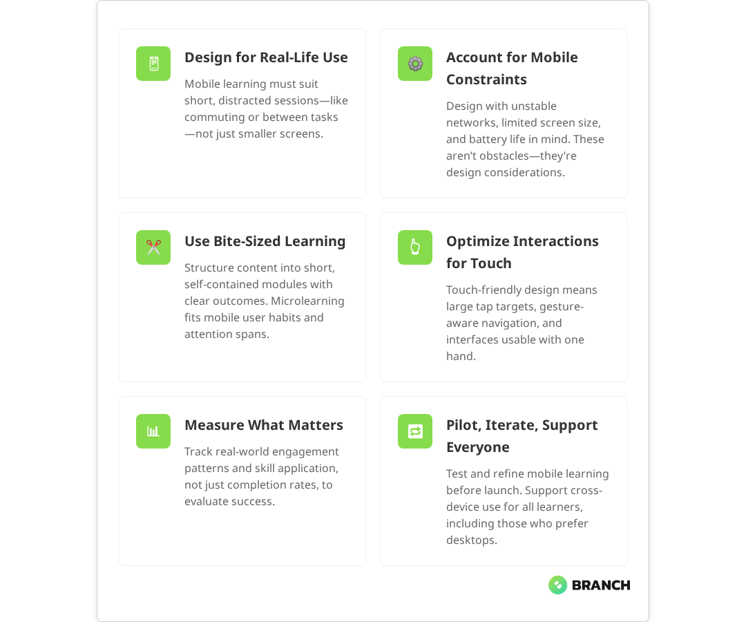
Mobile learning isn’t just about shrinking your existing content to fit smaller screens though that’s unfortunately what many organizations try first. It’s about fundamentally rethinking how people absorb, retain, and apply new skills when they’re on the move, distracted, and working in contexts that change by the hour.
This guide walks through the practical realities of designing mobile learning that actually works for busy, distributed teams. We’ll cover the technical considerations that matter, the design principles that stick, and the implementation strategies that help you avoid the most common pitfalls that turn promising mobile learning initiatives into expensive digital paperweights.
Understanding the Mobile Learning Context
Before diving into interface design or content strategy, it’s worth understanding what “mobile learning” actually means in practice. It’s not just learning that happens on phones it’s learning that fits into the fragmented, interrupted, context-switching reality of modern work.
Mobile learners typically engage with content in short bursts: five minutes between meetings, fifteen minutes during lunch, or while waiting for a delayed flight. Research consistently shows that mobile learning is consumed in brief, frequent sessions, often through microlearning modules lasting 2–5 minutes. They’re often multitasking, partially distracted, and operating with limited cognitive bandwidth. Studies demonstrate that mobile learners frequently face divided attention, which can impact learning performance, even as some adapt to these multitasking behaviors. Their environment changes constantly from quiet offices to noisy coffee shops to moving vehicles.
This context creates unique design challenges. Your content needs to be immediately accessible, cognitively lightweight, and resilient to interruption. Learners should be able to pick up where they left off without losing context, even if they’ve been pulled away for hours or days.
The Technical Reality
Mobile learning operates within real technical constraints that desktop-first designs often ignore. Network connectivity varies dramatically your learners might have blazing fast 5G one moment and spotty 3G the next. Current data from 2025 shows that while 5G covers just over half the global population with average speeds around 184 Mbps, significant coverage gaps remain, especially in rural areas where connectivity quality can drop substantially. Battery life matters when someone’s using their personal device for work-related learning. Screen real estate is limited, and touch interfaces behave differently than mouse-and-keyboard interactions.
These constraints aren’t bugs to work around they’re features of the mobile learning landscape that smart designers leverage rather than fight.
Core Design Principles for Mobile Learning
Effective mobile learning design rests on several key principles that differentiate it from traditional eLearning approaches. These aren’t just best practices they’re architectural decisions that shape how learners interact with and retain information.
Bite-Sized Content Architecture
The concept of “microlearning” gets thrown around a lot, but it’s often misunderstood. It’s not just about making content shorter it’s about creating complete, self-contained learning experiences that can stand alone while building toward larger learning objectives.
Each learning chunk should have a clear learning outcome, require minimal context to understand, and provide immediate value even if the learner never continues to the next module. Mobile learning design experts emphasize that content should be chunked into bite-sized pieces that are self-contained and designed for short bursts of engagement. Think of it like designing a collection of useful tools rather than chapters in a book.
Progressive Disclosure
Mobile interfaces excel at revealing information gradually, giving learners control over their cognitive load. Instead of presenting everything at once, structure content so that learners can dive deeper into areas that interest them while maintaining a clear path forward.
This might mean starting with key concepts and allowing learners to tap for examples, case studies, or additional detail. Or it could involve organizing content into expandable sections that let learners focus on what’s most relevant to their immediate needs.
Context-Aware Content
Mobile devices know things about their users that desktop computers don’t location, time of day, connectivity status, and usage patterns. Smart mobile learning platforms use this contextual information to deliver more relevant experiences. Research on context-aware mobile learning systems shows that platforms can effectively integrate multiple contextual factors including GPS location, device features, learner behavior patterns, and environmental conditions to provide personalized learning recommendations.
A field service app might surface equipment-specific training based on GPS location. A sales enablement platform could prioritize product updates based on upcoming calendar appointments. The goal isn’t to be creepy it’s to reduce the cognitive overhead of finding relevant information when attention spans are short.
Read more about establishing a structured eLearning development process that accounts for mobile-first design from the start.What the research says
- Multiple studies confirm that mobile learners prefer microlearning formats, with optimal engagement occurring in sessions lasting 3–7 minutes, particularly for mobile contexts where attention spans are naturally shorter.
- Research demonstrates that mobile multitasking significantly impacts learning performance, with divided attention reducing retention even among learners who adapt to multitasking behaviors.
- Context-aware mobile learning systems that use location, device features, and behavioral patterns to personalize content show improved learning outcomes and engagement rates.
- Early evidence suggests that progressive web applications (PWAs) provide effective cross-platform compatibility for mobile learning, but more research is needed on long-term retention outcomes compared to native apps.
Interface Design That Works on Small Screens
Mobile learning interface design requires a different mindset than desktop application design. The constraints of small screens and touch interactions create opportunities for more focused, intentional user experiences if you design for them deliberately.
Navigation and Information Architecture
Complex navigation systems that work fine on desktop become usability nightmares on mobile. Successful mobile learning platforms use flat information architectures, clear visual hierarchies, and navigation patterns that feel native to mobile users. Mobile-first eLearning design research emphasizes that effective platforms incorporate simplified, flat information architectures and clear, intuitive navigation optimized for mobile behaviors.
Consider using tab-based navigation for primary sections, progressive disclosure for detailed content, and clear visual indicators for learning progress. The goal is to minimize the number of taps required to access relevant content while maintaining clear wayfinding.
Touch-Friendly Interactions
Designing for touch isn’t just about making buttons bigger. It’s about understanding how people hold and interact with mobile devices in different contexts. Someone using their phone one-handed while standing on a train has different interaction capabilities than someone sitting at a desk with both hands free.
Critical interactive elements should be within easy reach of thumbs, important information should remain visible even when software keyboards are active, and gesture-based interactions should feel natural rather than gimmicky. Accessibility guidelines from W3C specify that mobile tap targets should be a minimum of 44 pixels to accommodate finger size and movement, balancing usability with motor accessibility.
| Design Element | Desktop Approach | Mobile Optimization | Key Consideration |
|---|---|---|---|
| Button Size | Precise cursor targeting | Minimum 44px tap targets | Accommodate finger size and movement |
| Content Layout | Multi-column layouts | Single-column, stacked content | Optimize for portrait orientation |
| Navigation | Horizontal menu bars | Bottom tabs or hamburger menus | Thumb-reach optimization |
| Form Inputs | Multiple fields visible | One field per screen step | Minimize typing, maximize completion |
| Media Playback | Embedded players | Full-screen optimization | Account for varying screen sizes |
Content Strategy for Mobile Consumption
The best mobile learning interface in the world won’t save poorly structured content. Mobile learners process information differently than desktop users, and your content strategy needs to account for these differences from the ground up.
Scannable Content Structure
Mobile users scan more than they read. Structure your content with clear headings, bulleted lists, and visual breaks that allow learners to quickly identify relevant sections. Use formatting to create clear information hierarchies bold for key concepts, bullets for actionable steps, and white space to prevent cognitive overload.
Each screen should focus on a single concept or task. If you find yourself scrolling through multiple screens of content to complete a single learning objective, consider breaking it into smaller, more focused modules. Industry best practices consistently recommend focusing on single concepts per screen and breaking content into smaller, focused segments that align with microlearning methodology.
Multimedia Optimization
Video and audio content can be incredibly effective for mobile learning, but they require careful optimization. Mobile users often consume content in environments where audio isn’t practical, so provide captions and visual alternatives. Keep video segments short under five minutes and ensure they remain useful even when viewed without sound. Educational video research consistently shows that learner attention drops significantly after 6–9 minutes, with shorter segments proving more effective for retention and accessibility.
Consider the data implications of multimedia content. Auto-playing videos or high-resolution images can quickly consume mobile data allowances, particularly for learners in areas with limited connectivity or expensive data plans.
Technical Implementation Strategies
The technical architecture underlying your mobile learning platform directly impacts user experience, completion rates, and long-term platform sustainability. While learners don’t care about your backend infrastructure, they definitely notice when it doesn’t work smoothly.
Offline-First Design
Mobile connectivity is inconsistent, even in major metropolitan areas. Designing for offline-first use ensures learners can access critical content regardless of network conditions. Technical literature on offline-first development widely supports this approach, recommending that mobile learning apps allow users to download specific modules and use intelligent caching for frequently accessed content to optimize performance and accessibility. This doesn’t mean your entire learning library needs to work offline it means identifying which content is most valuable during network interruptions and ensuring it remains accessible.
Consider allowing learners to download specific modules for offline use, implementing intelligent caching for frequently accessed content, and providing clear indicators about what’s available offline versus what requires network connectivity.
Performance Optimization
Mobile devices have less processing power and memory than desktop computers. Learning platforms need to be optimized for these constraints without sacrificing functionality. This means efficient code, optimized images, and careful attention to how content loads and renders on different devices.
Progressive loading can help display core content immediately while loading additional resources in the background. Lazy loading images and content that’s below the fold can improve initial page load times significantly.
Cross-Platform Considerations
Your learners use different devices, operating systems, and browsers. A truly effective mobile learning platform works consistently across this diversity without requiring separate apps or platform-specific content.
Progressive web applications (PWAs) often provide the best balance between native app functionality and cross-platform compatibility, offering features like offline access and push notifications without requiring app store distribution. Research on PWAs for learning platforms confirms they effectively bridge the gap between native app functionality and web platform reach, with multiple sources noting their ability to increase retention rates and reach learners across mobile devices.
Measuring Success in Mobile Learning
Traditional eLearning metrics completion rates, time spent, quiz scores tell only part of the mobile learning story. Mobile learners engage differently, and your measurement strategy needs to account for these differences.
Context-Aware Analytics
Understanding when, where, and how learners engage with mobile content provides insights that aggregate metrics miss. Are learners dropping off at specific points because the content is too complex, or because they’re consistently interrupted at that stage? Are certain modules more effective when consumed during commutes versus during dedicated study time?
Track engagement patterns alongside learning outcomes to identify optimization opportunities that wouldn’t be visible in traditional analytics dashboards.
Microlearning Metrics
When content is broken into small, focused chunks, traditional completion metrics become less meaningful. Instead, focus on metrics that reflect skill application and behavioral change. Are learners applying concepts from mobile modules in their work? Are they returning to reference specific content when facing real-world challenges?
Read more about custom eLearning development services that prioritize mobile-first design and learner-centered experiences.Implementation Planning and Change Management
Even the most thoughtfully designed mobile learning platform will fail if the implementation doesn’t account for organizational realities. Rolling out mobile learning requires careful change management, technical planning, and ongoing optimization based on real user behavior.
Piloting and Iteration
Start with a focused pilot program that allows you to test assumptions and refine approaches before full-scale deployment. Choose pilot participants who represent your broader learner population and are willing to provide honest feedback about what works and what doesn’t.
Use pilot feedback to refine content structure, interface design, and technical performance. What seems intuitive to your design team might be confusing to actual users, and early feedback helps identify these disconnects before they become expensive problems.
Supporting Different Learning Preferences
Not everyone learns effectively on mobile devices. Some people prefer desktop experiences for complex content, while others thrive on mobile-first approaches. Design your mobile learning strategy to complement rather than replace existing learning modalities.
Consider offering synchronized experiences that allow learners to start content on mobile and continue on desktop, or vice versa. The goal is meeting learners where they are, not forcing them into artificial constraints.
Working with Mobile Learning Specialists
Mobile learning design requires expertise that spans user experience design, educational psychology, technical architecture, and change management. Few organizations have all these capabilities in-house, making external partnerships valuable for mobile learning initiatives.
When evaluating potential partners, look for teams that understand both the technical constraints of mobile platforms and the pedagogical principles that drive effective learning outcomes. The best mobile learning solutions emerge from close collaboration between learning designers, user experience professionals, and technical implementers who understand how these domains intersect.
A specialized team like Branch Boston brings together comprehensive eLearning capabilities with mobile-first design thinking, helping organizations create learning experiences that work effectively across devices and contexts. This integrated approach ensures that technical implementation supports rather than constrains learning objectives.
Look for partners who emphasize iterative design, user testing with actual learners, and measurement strategies that go beyond basic completion metrics. The goal is creating sustainable learning platforms that evolve with your organization’s needs and your learners’ changing contexts.
The Future of Mobile Learning
Mobile learning continues evolving as device capabilities expand and workplace patterns shift. Emerging technologies like augmented reality, voice interfaces, and adaptive AI create new possibilities for contextual, personalized learning experiences.
However, the fundamentals remain constant: effective mobile learning respects learners’ time, fits into their workflow, and provides immediate value. Technology should enhance these core principles rather than complicate them.
Organizations that invest in thoughtful mobile learning design today position themselves well for whatever technological changes emerge next. By focusing on learner-centered design, technical flexibility, and continuous optimization, mobile learning platforms can adapt to new capabilities without requiring complete rebuilds.
The key is building learning systems that are robust enough to evolve while remaining simple enough for busy people to actually use. That balance between sophisticated capabilities and everyday usability defines successful mobile learning implementations.
FAQ
How do you handle learners who prefer desktop-based training over mobile learning?
The most effective approach is offering synchronized experiences that work across devices rather than forcing learners into mobile-only solutions. Design content that can be started on one device and continued on another, and ensure that mobile learning complements rather than replaces existing learning modalities. Some complex content genuinely works better on larger screens, and acknowledging this creates more learner buy-in for mobile components that do add value.
What's the ideal length for mobile learning modules to maintain engagement?
Most effective mobile learning modules range from 3-7 minutes, but length matters less than completeness and focus. Each module should address a single learning objective with immediate practical value. The key is designing content that can be consumed in realistic mobile contexts during commutes, between meetings, or while waiting rather than arbitrary time limits that might cut off important concepts mid-explanation.
How do you ensure mobile learning content works reliably on different devices and operating systems?
Focus on responsive web design and progressive web applications rather than native apps when possible. Test content across different screen sizes, operating systems, and network conditions during development. Use standard web technologies that work consistently across platforms, and implement progressive loading to ensure core content displays quickly regardless of device capabilities or network speed.
What are the most important metrics for measuring mobile learning effectiveness?
Beyond completion rates, track engagement patterns like when and where learners access content, which modules they return to reference, and how mobile learning translates to behavioral changes in their work. Context-aware analytics help identify whether learners drop off due to content complexity or environmental factors. Focus on metrics that reflect skill application and long-term retention rather than just consumption statistics.
How do you balance comprehensive learning content with the constraints of small screens?
Use progressive disclosure to layer information complexity start with core concepts and allow learners to tap for examples, details, or advanced applications. Structure content into complete, self-contained learning chunks that build toward larger objectives rather than trying to compress lengthy courses into smaller formats. Consider which concepts truly need comprehensive treatment versus what can be effectively taught through focused, mobile-optimized experiences.