A logo might look deceptively simple—just a mark, some type, maybe a color or two. But behind every effective logo is a structured design process that transforms business goals and brand values into a visual symbol that works across contexts, from business cards to billboards to mobile apps.
For B2B leaders evaluating branding projects or working with design teams, understanding the logo design process helps you set realistic expectations, collaborate more effectively, and ensure the final mark serves your organization’s long-term needs. Whether you’re launching a new venture, refreshing an existing brand, or creating subsidiary marks, knowing how professional designers approach logo development can mean the difference between a logo that works and one that creates ongoing friction.
The Foundation: Research and Discovery
Effective logo design starts well before anyone picks up a pencil or opens design software. The discovery phase involves understanding your business, audience, competitive landscape, and brand positioning. Multiple professional design agencies emphasize that this foundational step includes stakeholder interviews, brand audits, and market research. This isn’t just about what you think your logo should look like—it’s about uncovering what it needs to accomplish.
Professional designers typically begin with stakeholder interviews, brand audits, and market research. They’ll explore questions like: What are your core values? Who is your primary audience? What industry conventions exist, and which should you embrace or avoid? How will the logo be used—digitally, in print, at small sizes, in single-color applications?
This groundwork prevents the all-too-common scenario where a logo looks great in isolation but fails when applied across real-world touchpoints. The discovery phase also helps identify potential trademark conflicts early, saving costly revisions down the line.
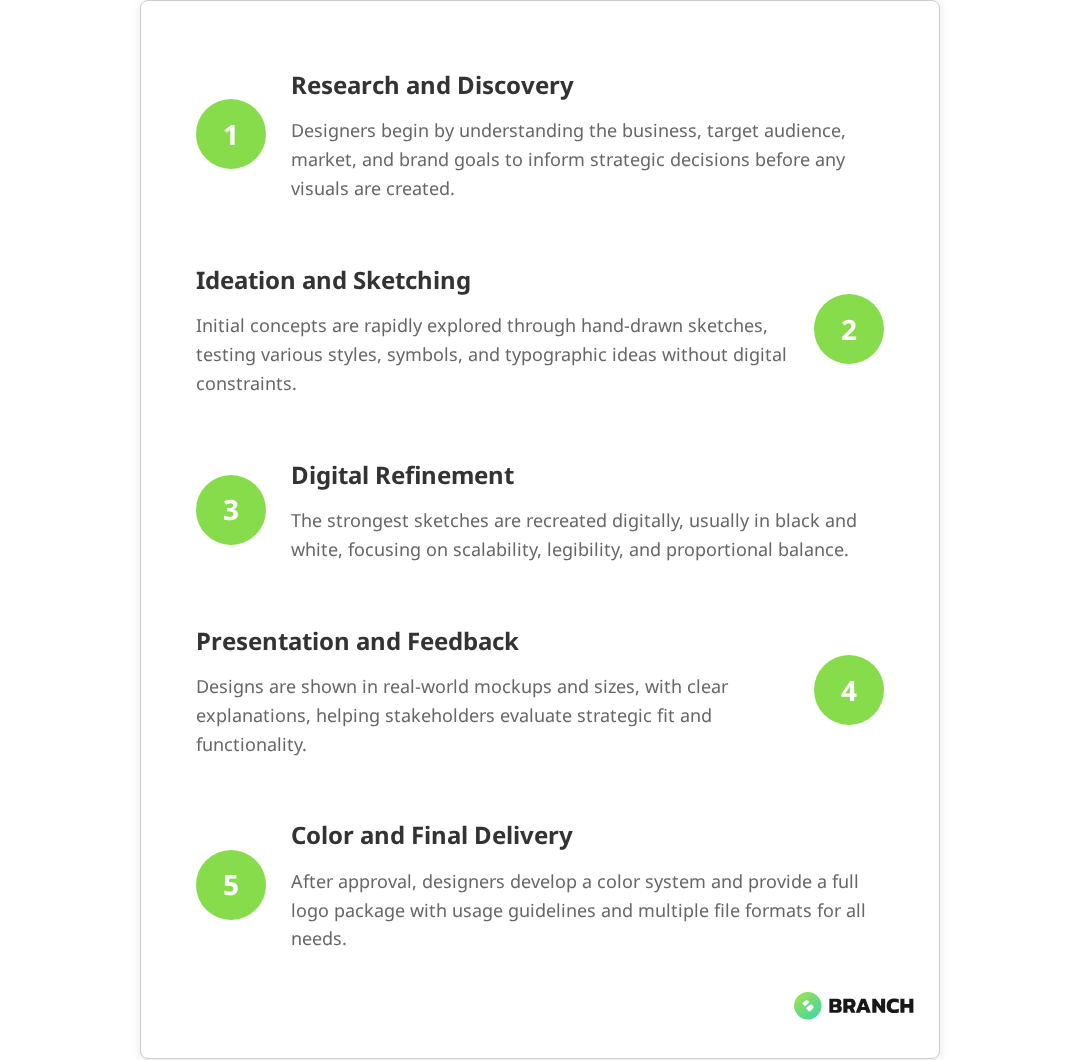
Ideation: From Concepts to Sketches
Once the strategic foundation is established, designers move into ideation—the creative exploration phase where initial concepts take shape. Contrary to what you might expect in our digital-first world, most experienced designers still start this phase with paper and pencil.
There’s a practical reason for this analog approach: sketching facilitates rapid ideation without the constraints or distractions of design software. Designers often produce dozens of rough concept sketches, exploring different visual directions, symbolic approaches, and typographic treatments. Research supports that generating many initial sketches prevents premature attachment to a single concept and increases the likelihood of discovering unexpected creative solutions.
Key activities during ideation include:
- Thumbnail sketching: Quick, small drawings that capture basic concepts and compositions
- Word association: Exploring visual metaphors and symbolic connections related to your brand
- Typography exploration: Testing different approaches to letterforms, custom type, and text-mark relationships
- Style variation: Exploring the same concept through different aesthetic lenses—minimal, illustrative, geometric, organic
This phase is intentionally divergent. The goal isn’t to find the logo yet, but to explore the full range of possibilities within your brand’s strategic parameters.
Read more about how brand positioning influences visual identity decisions.Refinement: From Sketches to Digital
After ideation generates a range of concepts, designers select the most promising directions for digital refinement. Industry practice shows that professionals typically choose the strongest concepts from their initial sketches and transform these rough ideas into precise, scalable vector graphics—but the transition happens methodically.
Professional designers typically begin digital work in black and white. This might seem counterintuitive when color feels like such an important brand element, but there’s strategic logic here: a logo that works effectively in black and white will work in any color application. Designing in monochrome forces focus on form, proportion, and visual hierarchy without the distraction of color relationships.
During digital refinement, designers address technical considerations that weren’t apparent in sketches:
- Scalability: How does the logo perform at business card size versus billboard size?
- Readability: Are fine details legible when the logo appears small on mobile screens?
- Proportion: Do the relationships between elements feel balanced across different sizes?
- Versatility: Can the logo work as a horizontal layout, stacked layout, or icon-only version?
This phase involves multiple rounds of refinement, with designers making subtle adjustments to spacing, weight, and proportions that might not be obvious to non-designers but significantly impact the logo’s effectiveness.
Presentation and Stakeholder Review
How logo concepts are presented to stakeholders can make or break the decision-making process. Experienced design teams don’t just show logos in isolation—they present them in context, demonstrating how each concept works across anticipated applications. Professional presentation best practices consistently emphasize showing logos at different sizes, in real-world mockups, and with clear strategic rationale.
Effective logo presentations typically include:
- Multiple size tests: The same logo shown at large, medium, and small scales
- Application mockups: The logo applied to business cards, letterhead, website headers, or product packaging
- Variation demonstrations: Horizontal, stacked, and icon-only versions where applicable
- Rationale explanation: How each concept connects to brand strategy and business objectives
| Review Stage | Focus Areas | Key Questions |
|---|---|---|
| Initial Concepts | Strategic alignment, creative direction | Does this capture our brand personality? Does it differentiate us appropriately? |
| Refined Options | Functionality, versatility | How does this work across our planned applications? Is it memorable and recognizable? |
| Final Selection | Technical execution, long-term viability | Can we implement this consistently? Will this serve us well as we grow? |
The review process works best when stakeholders understand they’re evaluating strategic effectiveness, not personal aesthetic preferences. The question isn’t “Do I like this?” but “Will this serve our business objectives effectively?”
What the research says
Evidence-based insights from logo design research and professional practice reveal several key patterns:
- Professional logo design processes consistently follow structured phases, with comprehensive projects typically taking 4-8 weeks including discovery, concept development, refinement, and delivery preparation.
- Most experienced designers generate 20-50 initial sketch concepts during ideation, but present only 3-5 refined digital concepts to clients to prevent decision paralysis while ensuring strategic focus.
- Testing logos at extreme scales—very small and very large—and across single-color applications reliably identifies potential usability issues before implementation.
- Comprehensive brand guidelines that specify proper logo usage demonstrably prevent brand degradation over time compared to logos delivered without implementation standards.
- Early research shows that logos tested across anticipated real-world applications during the design process perform more consistently after launch, though more systematic study of this relationship would be valuable.
Color Development and Finalization
Once the logo form is approved in black and white, designers move to color development. This isn’t simply about picking colors that look nice—it’s about creating a color system that works across all planned applications while reinforcing brand personality and ensuring practical usability.
Professional color development considers:
- Brand psychology: How do color choices reinforce desired brand perceptions?
- Industry context: What color conventions exist in your market, and how should you relate to them?
- Technical constraints: How do colors reproduce across digital screens, offset printing, embroidery, and other production methods?
- Accessibility: Do color combinations meet contrast requirements for digital accessibility?
Industry best practices show that the final logo package typically includes multiple color specifications—full-color versions, single-color versions, reverse (white on dark) versions, and guidance for minimum contrast requirements. This comprehensive approach ensures consistent implementation across diverse applications.
Read more about developing comprehensive visual identity systems beyond just logo design.Delivery and Implementation Guidelines
A logo project doesn’t end with a final design file. Professional logo development includes comprehensive delivery that sets up successful long-term implementation. This typically involves multiple file formats, usage guidelines, and clear documentation that helps everyone—from internal teams to external vendors—implement the logo consistently.
Professional sources confirm that a complete logo delivery package includes:
- Vector files (AI, EPS): Scalable source files for professional printing and large-format applications
- High-resolution rasters (PNG, JPG): Pixel-based files for web, email, and standard printing needs
- Web-optimized files (SVG): Scalable web graphics that load quickly and display crisply on all devices
- Usage guidelines: Clear rules about minimum sizes, clear space requirements, color usage, and what not to do
- Brand standards document: Comprehensive guide showing proper logo application across various contexts
These implementation guidelines prevent the slow degradation that happens when logos are repeatedly modified, poorly reproduced, or used inconsistently across touchpoints. They’re particularly crucial for B2B organizations where the logo might be implemented by multiple departments, agencies, or partner organizations.
When to DIY vs. Hire Professionals
The logo design process can be handled internally, through freelancers, or via specialized agencies—but the best choice depends on your specific situation, timeline, and long-term brand ambitions.
Consider handling logo design internally when:
- You have experienced design talent on staff
- The logo serves a limited, short-term purpose
- Brand requirements are straightforward and well-understood
- Timeline and budget constraints are significant
Research into professional versus DIY approaches shows that external design professionals add particular value when:
- The logo will represent significant business value over time
- You need objective perspective on brand positioning
- Technical requirements are complex (trademark searches, comprehensive file delivery)
- You want comprehensive brand guidelines and implementation support
- The project involves multiple stakeholders who need structured decision-making processes
Many organizations benefit from a hybrid approach—handling initial strategy and requirements definition internally, then partnering with design specialists for creative development and technical execution. This leverages internal brand knowledge while bringing in specialized expertise for the creative and technical challenges specific to logo development.
Read more about comprehensive branding approaches that integrate logo design with broader identity development.How a Design Partner Can Add Value
For B2B organizations evaluating logo design projects, the right design partner brings more than just creative execution. Experienced teams help navigate the strategic and technical complexities that make the difference between a logo that works and one that creates ongoing challenges.
A strategic design partner typically contributes:
- Process facilitation: Structured workflows that keep stakeholders aligned and projects moving efficiently
- Strategic perspective: Outside viewpoint on competitive positioning and market differentiation
- Technical expertise: Knowledge of trademark considerations, production requirements, and implementation best practices
- Comprehensive delivery: Complete file packages and implementation guidelines that support long-term success
The most effective partnerships happen when organizations come prepared with clear business objectives, realistic timelines, and decision-making processes that allow for collaborative refinement without endless revision cycles.
For organizations ready to move forward with strategic logo development, working with a team that understands both creative excellence and business implementation can ensure your logo serves as an effective brand asset for years to come.
Explore our creative services and brand development capabilities or get in touch to discuss your logo and branding needs.
FAQ
How long should a professional logo design process take?
Research shows that a comprehensive logo design process typically takes 4-8 weeks, depending on complexity and stakeholder review cycles. This includes discovery (1-2 weeks), initial concept development (1-2 weeks), refinement and stakeholder feedback (2-3 weeks), and final delivery preparation (1 week). Rushing this timeline often leads to less strategic outcomes and more revision cycles.
Why do designers start with black and white instead of color?
Designing first in black and white ensures the logo works independently of color, making it more versatile across applications. A logo that relies on color to be effective will fail in single-color applications like faxes, embossing, or cost-effective printing. Starting with strong black and white forms creates a foundation that works in any color application.
Should I expect to see dozens of logo concepts during the design process?
Most professional processes show 3-5 refined concepts rather than dozens. While designers may sketch 20-50 rough ideas during ideation, they select only the strongest directions for digital development and client presentation. Too many options can create decision paralysis and dilute focus from strategic evaluation of the most viable concepts.
What file formats do I need for a complete logo package?
A complete package includes vector files (AI, EPS) for scalability, high-resolution rasters (PNG, JPG) for standard applications, and web-optimized formats (SVG) for digital use. You should also receive files in multiple color variations—full color, single color, and reverse versions—plus clear usage guidelines for consistent implementation.
How do I know if my logo will work across all the places I need to use it?
Test your logo at extreme scales—very small (like a social media profile image) and very large (like a trade show banner). Ensure it works in single color and reverse applications. Consider all your touchpoints: business cards, email signatures, website headers, mobile apps, signage, and any industry-specific applications. A good designer will show you these applications during the design process.