
A visual identity system isn’t just a logo and a color palette—it’s the visual DNA that makes your organization recognizable, trustworthy, and memorable across every touchpoint. Research consistently shows that comprehensive visual identity systems, when applied consistently across all touchpoints, create recognition, build trust, and enhance memorability far beyond what individual design elements can achieve. Yet too many teams treat it as an afterthought, slapping together assets without considering how they’ll work together at scale, or worse, over-investing in polish before they’ve figured out what actually matters to their audience.
For B2B leaders evaluating their brand presence, the stakes are real. Your visual identity system directly impacts how prospects perceive your expertise, how partners engage with your content, and how your own team presents your work consistently. Multiple studies confirm that consistent and well-designed visual identity signals reliability, builds trust, and strengthens recognition across all stakeholder groups. Get it right, and you create a foundation for growth. Get it wrong, and you’re fighting an uphill battle for credibility in every conversation.
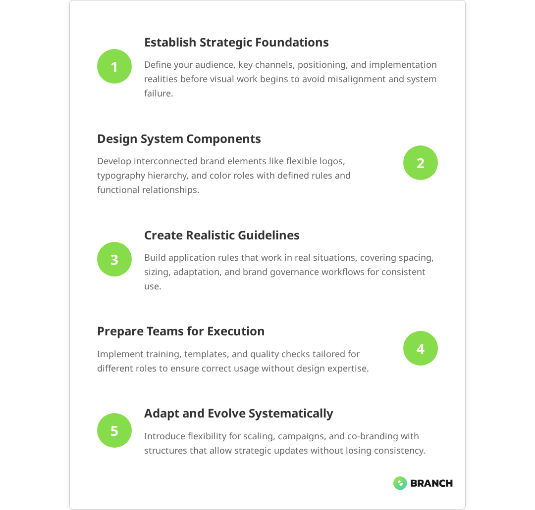
This guide breaks down how to build a visual identity system that serves your business goals—not just your aesthetic preferences—with practical frameworks for scoping, creating, and implementing a system that evolves with your organization.
What Makes a Visual Identity System Actually Systematic
The difference between a collection of brand assets and a true visual identity system lies in intentional relationships. A system anticipates how elements will combine, conflict, and scale across different contexts, from business cards to software interfaces to conference presentations.
At its core, an effective visual identity system includes:
- Brand foundation elements: logo variations, typography hierarchy, color palette with specific usage rules
- Application guidelines: how elements combine in real scenarios, spacing requirements, size limitations
- Flexibility frameworks: approved ways to adapt the system for different audiences, channels, or campaign needs
- Governance structure: who makes decisions about changes, how new applications get approved, what’s off-limits
The key insight here is that a visual identity system succeeds not because every element is perfectly designed in isolation, but because the relationships between elements are clearly defined and consistently applied. Multiple expert sources confirm that effectiveness relies on clearly defined rules, relationships, and consistent application of visual elements under documented guidelines to create a unified brand experience. This is why many beautifully designed brands fall apart in practice—they lack the connective tissue that makes individual components work together.
The Strategic Foundation: Why Visual Identity Systems Fail
Most visual identity projects stumble at the strategy stage, not the design stage. Research shows that branding failures stem primarily from strategic failures rather than design execution, with poor brand strategy development identified as a ‘fatal error’ that leads to brand downfall. Teams jump straight to aesthetics without establishing the strategic framework that should guide every visual decision. This leads to systems that look good in isolation but don’t serve the business effectively.
Common strategic failures include:
- Audience misalignment: designing for the wrong stakeholder (often internal preferences rather than audience needs)
- Channel blindness: not considering where and how the identity will actually be used
- Scale naivety: creating systems that work for current needs but break as the organization grows
- Implementation gaps: beautiful guidelines that no one can actually execute consistently
Studies indicate that 71% of customers switch brands due to misaligned values or poor messaging, highlighting how audience misalignment undermines brand effectiveness when teams prioritize internal design preferences over customer-focused implementation.
Before any visual work begins, successful identity projects establish clear answers to these strategic questions:
| Strategic Area | Key Questions | Output |
|---|---|---|
| Audience Definition | Who needs to recognize and trust us? What visual cues matter to them? | Primary and secondary audience profiles with visual preferences |
| Channel Mapping | Where will this identity live? What are the technical constraints? | Priority touchpoint list with specifications and limitations |
| Brand Positioning | What do we want to be known for? How do we differ from alternatives? | Clear positioning statement that guides visual choices |
| Implementation Reality | Who will use this system? What are their skills and constraints? | Implementation requirements and governance framework |
What the research says
- Companies with clear, consistent brand strategies achieve up to 23% higher revenue compared to those with inconsistent branding, demonstrating the fundamental importance of strategic clarity over aesthetic preferences.
- Visual identity systems that include comprehensive governance structures—with defined decision-making roles and approval workflows—maintain brand integrity more effectively than systems relying on individual judgment calls.
- Organizations that plan for scalability from the outset avoid costly rebrands, while those that design only for current needs often face system breakdowns as they grow across new channels and team structures.
- Early research suggests that the most common failure point is the gap between creating beautiful guidelines and achieving consistent implementation, though more systematic study of this implementation challenge is needed.
Building the Core System: Components and Relationships
With strategy established, the actual system development follows a structured approach that prioritizes relationships over individual elements. This isn’t about making everything look the same—it’s about making everything work together intentionally.
Logo Architecture and Flexibility
Your logo isn’t a single asset—it’s a family of related marks that work across different contexts. Most organizations need at least three variations:
- Primary mark: full logo for ideal conditions (sufficient space, high visibility)
- Secondary mark: simplified version for small or low-contrast applications
- Icon/symbol: standalone element for social media, favicons, or branded patterns
Multiple credible sources in the branding and design industry confirm that these three variations help brands adapt their visual identity for different sizes, orientations, and uses while maintaining brand recognition. Each variation should feel connected but serve different functional needs. The relationship between these elements—shared color, typography, or visual style—creates the systematic foundation that extends to other brand components.
Typography That Actually Works
Typography hierarchy goes beyond picking fonts. An effective system defines specific relationships between different text treatments, ensuring that headlines, body copy, and supporting text work together to guide attention and comprehension.
Key considerations include:
- Accessibility requirements: contrast ratios, reading levels, screen reader compatibility
- Technical constraints: web fonts vs. system fonts, licensing across teams, file size implications
- Brand personality alignment: how typography choices reinforce your positioning and audience expectations
- Scalability: how the hierarchy adapts from business cards to billboards to mobile interfaces
Color Strategy Beyond Pretty Palettes
Color decisions in a visual identity system aren’t aesthetic choices—they’re functional ones. Every color needs a job, and the palette needs to work across different media, accessibility requirements, and cultural contexts your audience brings to the interaction. Research emphasizes that color choices in branding should be deliberate and functional, with colors having defined roles and meeting accessibility standards for inclusive communication.
A systematic approach to color includes:
- Primary palette: 2-3 core colors that represent your brand in high-impact applications
- Secondary palette: 3-5 supporting colors that provide flexibility without diluting brand recognition
- Neutral system: grayscale progression that works with your brand colors and provides hierarchy options
- Functional colors: specific colors for interactive states, error messaging, or category organization
Each color group needs defined usage rules, accessibility considerations, and approved combinations. This prevents the common problem where brand colors look great in presentations but create readability issues in actual applications.
Application Guidelines That People Actually Follow
The most beautifully designed system fails if people can’t implement it consistently. Effective application guidelines anticipate real-world constraints and provide clear decision-making frameworks rather than rigid rules.
Practical guidelines address:
- Minimum size requirements: when to use which logo variation based on actual dimensions
- Color adaptation rules: how to maintain brand integrity when your preferred colors don’t work
- Spacing and proportion: mathematical relationships that ensure visual balance across applications
- Approval processes: who decides when something is “on-brand” and what happens when it’s not
Implementation Strategy: From Guidelines to Reality
The gap between beautiful brand guidelines and consistent implementation kills most visual identity systems. Multiple sources confirm that companies often develop strong visual identity rules that look good on paper but are not practical or tested in real-world settings, leading to inconsistent application and eventual brand erosion. Success requires thinking beyond the design phase to consider who will use the system, how they’ll access it, and what support they’ll need to execute it effectively.
Team Alignment and Training
Different team members need different levels of brand system knowledge. Your sales team doesn’t need to understand color theory, but they need to know which presentation template to use for different prospect types. Your marketing team needs deeper system knowledge to create new materials that feel cohesive.
Effective implementation includes:
- Role-specific training: tailored guidance for different team functions and skill levels
- Template libraries: pre-built assets that make correct implementation easier than incorrect implementation
- Decision trees: clear frameworks for choosing between options when guidelines don’t cover specific situations
- Quality checkpoints: regular review processes that catch inconsistencies before they become habits
Scaling and Evolution: When to Adapt vs. When to Hold Firm
A rigid visual identity system breaks under the pressure of real business needs. A system without boundaries loses its effectiveness through inconsistent application. The key is building flexibility into the system itself rather than making exceptions on a case-by-case basis.
Strategic flexibility might include:
- Audience-specific variations: approved ways to adapt tone or emphasis for different stakeholder groups
- Campaign extensions: guidelines for temporary brand expressions that connect to but don’t dilute the core identity
- Partnership accommodations: frameworks for co-branding that maintain your identity integrity
- Evolution pathways: processes for updating the system as your organization and market evolve
The organizations that get this right treat their visual identity system as a living framework rather than a fixed set of rules. They build in mechanisms for learning, feedback, and systematic improvement that keep the brand relevant and effective over time.
When to Build In-House vs. When to Bring in Specialists
The decision to develop a visual identity system internally or work with external specialists depends more on strategic complexity than design complexity. If your brand challenges are primarily about internal alignment and consistent execution, you might have the capabilities in-house. If you’re repositioning for new markets, differentiating in crowded competitive landscapes, or scaling across multiple audience segments, specialist experience becomes valuable.
Consider external support when you need:
- Strategic objectivity: outside perspective on positioning and audience needs
- Technical expertise: complex applications across digital and physical touchpoints
- Change management: experience helping organizations adopt new brand systems
- Efficiency: faster development timeline than internal resources allow
The best collaborations happen when organizations are clear about what they want to own internally (ongoing management, template updates, campaign applications) versus what they want specialist help with (strategic foundation, core system development, implementation training).
Teams like Branch Boston specialize in translating complex organizational needs into clear, systematic visual expressions that work across different stakeholder groups and technical environments. The value isn’t just in design execution—it’s in strategic thinking that connects brand expression to business objectives and operational realities.
Measuring Success: Beyond “Does It Look Good?”
Visual identity systems succeed when they solve business problems, not when they win design awards. Effective measurement focuses on adoption rates, consistency levels, and business impact rather than aesthetic preferences.
Key success metrics include:
- Adoption consistency: how often team members choose the right brand elements without guidance
- Implementation speed: how quickly new materials can be created that feel cohesive with existing brand expression
- Stakeholder recognition: whether your target audience recognizes and responds positively to your brand across different contexts
- Operational efficiency: reduction in time spent on brand-related decisions and revisions
The most successful visual identity systems become invisible infrastructure—they make everything else work better without calling attention to themselves. When your team stops having conversations about whether something “feels on-brand” because the system makes those decisions obvious, you’ve built something that serves your organization effectively.
FAQ
How long does it take to develop a complete visual identity system?
Development timelines vary based on organizational complexity and scope, but most comprehensive systems take 8-16 weeks from strategy through implementation guidelines. This includes stakeholder alignment (2-3 weeks), core system development (4-6 weeks), application design (3-4 weeks), and implementation support (2-3 weeks). Rushing this process usually creates gaps that require expensive fixes later.
What's the difference between a visual identity system and a brand style guide?
A style guide documents existing brand elements, while a visual identity system creates intentional relationships between elements that work across different contexts. Style guides are often static documents; identity systems include frameworks for making new decisions consistently. Think of it as the difference between a parts catalog and an assembly manual.
How do I know if our current brand assets can be evolved or if we need to start from scratch?
Audit your existing assets against your strategic positioning and audience needs. If your current elements support your positioning and work across required channels, evolution is often more efficient than starting over. However, if there's a fundamental misalignment between your visual expression and business strategy, or if quality or technical issues prevent consistent implementation, rebuilding may be necessary.
What happens when team members disagree about brand applications?
This is why governance structure is critical. Effective systems include decision-making frameworks and designated brand stewards who can resolve questions quickly. The goal isn't to eliminate all subjective judgment but to provide objective criteria for brand decisions. Most disagreements resolve when there are clear functional criteria (audience fit, technical feasibility, strategic alignment) rather than just aesthetic preferences.
How often should we update or refresh our visual identity system?
Minor updates happen continuously as you learn what works in practice. Major refreshes typically happen every 5-10 years or when there's significant business strategy change. However, the system itself should be built to accommodate evolution—new applications, audience segments, or channel requirements—without requiring complete overhauls. Regular audits help you distinguish between system problems and implementation problems.